Finding Solutions
You could say that the job of a designer is to know where to find things and use the right tools, so you don’t have to reinvent the wheel every time you design something.
Samantha Warren started the style tile craze back in 2012 with an article on A List Apart and The Washington Examiner case study.

At the time, we were trying to solve a problem. Clients came to our web agency asking for a responsive web design. They would say, “We want something clean and modern. You know, something that looks like Apple, but with our logo instead.”
Usually, they would have some grand ideas about how this new site would be all that they would need to help people find them and discover what they could do for them. They might have a terrible logo and a brochure that talked about their products or services. “Can you make this catalogue a website?”
The client would give you a JPEG of their logo. We might ask, “Do you have a vector-based version, like an AI file or an EPS?” And they would reply, “What’s that?”
Invariably, we would take whatever we were given and try to create something beautiful: a home page and a content page design. We would use some Lorem Ipsum placeholder copy and we would throw in some stock imagery, because we could only guess at what they wanted to say on their website. They had no content.
Then, they would say, “That looks great. I’ll get our office manager to write some text and get a smart phone to take some photos of our staff.”
This is the sort of situation that would lead Jeffrey Zeldman to say, “Content precedes design. Design in the absence of content is not design, it’s decoration.”—not long after Twitter was invented.
Content precedes design. Design in the absence of content is not design, it's decoration.
— zeldman (@zeldman) May 5, 2008
It would also lead Stephen Hay to say, “We’re not designing pages, we’re designing systems of components.” And Brad Frost would write about atomic design as a way to understand the design systems we were building as libraries of UI elements, components, and design patterns.

Style Tiles
Maybe a year after finishing the first page layout concepts for the website, the client might come back to us with a CD-ROM of images and a Word document, and we would throw out those designs we had made a year ago and start over with actual content.
At that point, we decided that creating page layouts for a desktop site was short-sighted. The work would get thrown out as soon as we had real content to work with. So, why don’t we alleviate the fears that clients had about seeing a lot of boxy and boring site maps and wireframe layouts by giving them a little taste of the visual design at the beginning of the process with a style tile? We would be able to get on the same page by defining the basic visual elements of the brand: logo, imagery, texture, color, typography, and some basic user interface (UI) elements, such as form fields and buttons. Then, we would be able to extrapolate from there to create the rest of the UI kit. From there we could build an entire design system.
Content Strategy
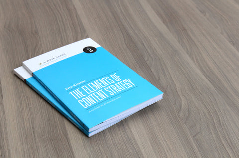
We would try to educate the client about how there is nothing worse than stale content on a website. You thought you were in the widget business, but now you are in the content marketing business. You need to generate and maintain content. So, the content strategy business was born, led by Kristina Halvorson of Brain Traffic, who wrote the book on Content Strategy, and the foreword to The Elements of Content Strategy.
Responsive Web Design
People were still in the mode of trying to recreate print designs on the web, but the responsive web design movement, championed by Ethan Marcotte, really messed them up. What do you do when the screen sizes keep changing? One single design is not going to work across all these devices. The web is not print. An app is not a PDF viewer.
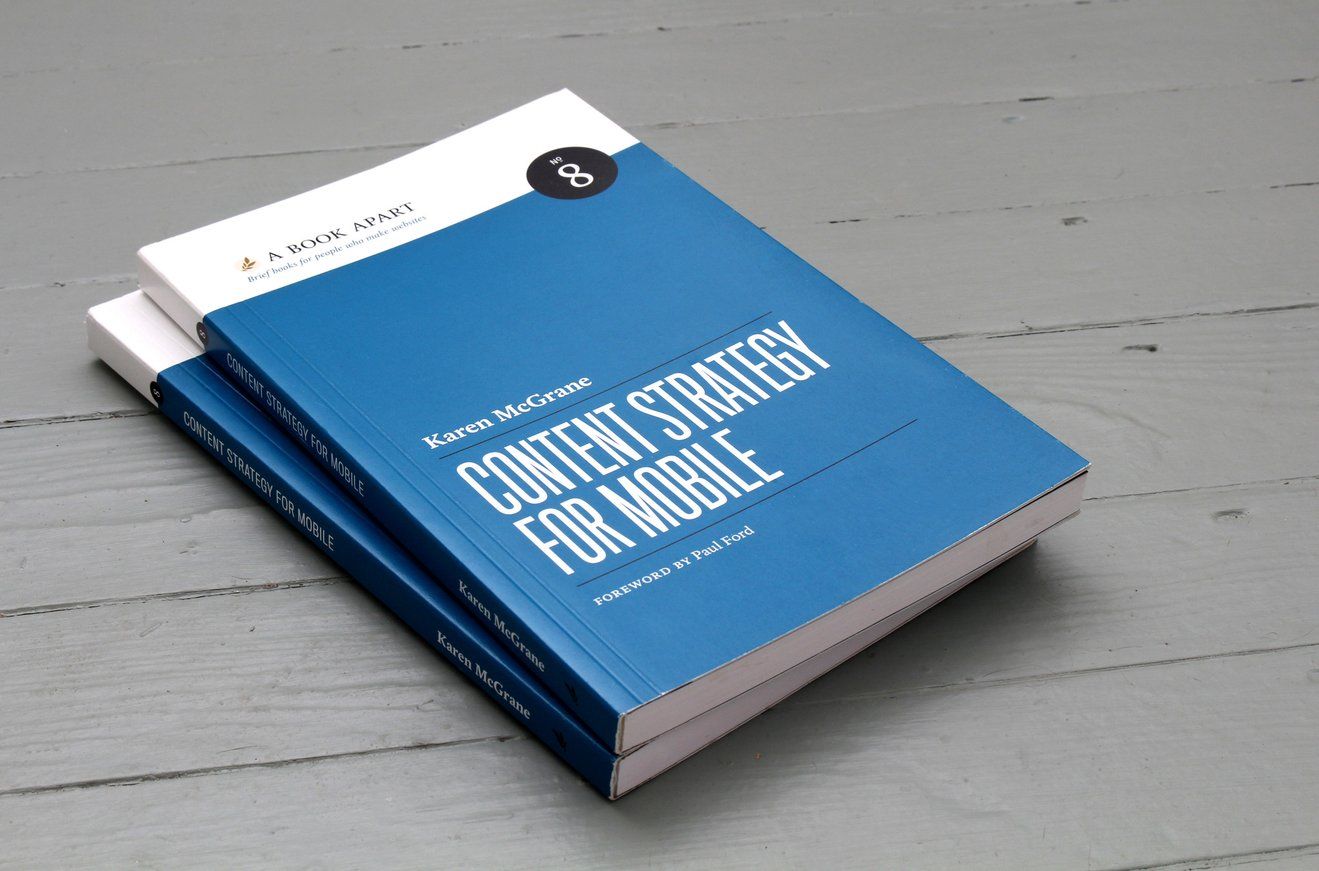
Karen McGrane, in her book Content Strategy for Mobile, would try to help people understand that our WordPress sites were making a mess of the web. Content was being thrown indiscriminately into fancy, pixel-perfect page layouts without a thought to how that information might be used across multiple media channels.

She would describe the zombie apocalypse of problems that we were creating for ourselves by building stuff that would be unusable in a few years because we hadn’t planned for the reality that technologies change and fancy new systems become obsolete over time.
How should we future-proof our work, then? Karen McGrane recommended the approach that NPR had proven. How can we COPE with this situation? Create once, publish everywhere.
Years later, we are still trying to figure this out.
- Collections Trust: Create Once, Publish Everywhere (COPE)
- Context and audience are important, and Create Once Publish Everywhere (COPE) is bit of a myth.
- The Right Way to Create Once, Publish Everywhere
- “Create Once, Publish Everywhere” With WordPress

In 2019, I travelled to San Francisco to participate in a conference that explored the ways that developers are finding to figure out how we COPE using the JAMstack. It is a model that holds a lot of promise, and enterprises are picking up on this and sharing what they are learning. Notably, Nicole Sullivan, Product Manager for Chrome at Google, was speaking at the conference about design systems, frameworks and browsers.
(A warning: these videos might get technical, because they are speaking primarily to developers who are pushing at the edges of what is possible with the latest technologies.)
- Design systems, frameworks and browsers
- Matter Supply fast tracks iconic Nike campaign with the JAMstack
- How to rebuild digital services for a multi-national restaurant chain from scratch
- Loblaw Digitals (LD) journey from building 9 digital experiences in 7 years, to preparing for rolling out 150+ in 1 year.
Resources
- Typewolf: The 40 Best Free Fonts Available on Google Fonts
- The Ultimate Collection of Google Font Pairings (Displayed Beautifully with Classic Art)
- Canva's ultimate guide to font pairing
- FontPair
- FontShop: Great Pairs
- Font Sizes in UI Design: The Complete Guide
- Why Beginning Designers Don't Need to Learn Grids, Type Scales, or Color Theory (and other “Designer Dogma”)


