Chris Do
Chris Do is an Emmy award-winning designer, director, CEO and Chief Strategist of Blind and the founder of The Futur—an online education platform with the mission of teaching 1 billion people how to make a living doing what they love.

He currently serves as the chairman of the board for the SPJA, and as an advisor to Saleshood. He has also served as: advisory board member for AIGA/LA, Emmys Motion & Title Design Peer Group, Otis Board of Governors, Santa Monica College and Woodbury University.
He has taught Sequential design for over 15 years at ArtCenter College of Design as well as Otis College of Art and Design. Additionally, he has lectured all over the world including: AIGA National Design Conference, Birmingham Design Festival, Awwwards New York/San Francisco/Amsterdam, AIGA Miami, The Design Conference Brisbane, Creative South, Digital Design Days Milan/Geneva, Lu Xun Academy Fine Art Dalian, Motion Conference Santa Fe, VMA Design Conference, MIT Boston, Bend Design Conference, Graphika Manila, Create Philippines, Rise Up Summit Cairo, RGD Design Thinkers Toronto, California Institute of the Arts, LA Art Institute, Otis College of Design, UCLA, MGLA, Cal State Los Angeles/ Northridge, Post Production World, Adobe Video World and San Diego University.
His firm’s work has been recognized by national and international organizations such as: the Emmy’s, Clio, Effie Gold, Huffington Post, Lynda.com, Webbie, Communication Arts, London International Awards, One Show, British D&AD, AICP 20, Pictoplasma, How, 72 dpi, L.A. Weekly, Boards, Res 10, Type Director’s Club (20, 22, 23, 26), IDN, Addy Awards, BDA, Create, Stash (2, 12, 22, 24, 35, 43, 65), Creatie Augustus 2010, Motion Design, Asia Image, Brief, 365 AIGA Year In Design 26, Art Director’s Club, Motionographer, New York Festivals, B Brand, PPaper, I.D., and Print.
Mr. Do has given talks and conducted workshops on: Sales, Negotiations, Value Based Pricing, Mindset, Branding, Graphic & Motion Design, Social Media Marketing, Entrepreneurship, Business Management, and Client Relations.


Typography Manual Vol.1
01 Flush Left
When in doubt, set your type flush left, ragged right. Why? In Western culture, people read from top to bottom, left to right. By justifying type left, the eye is able to find the edge, and read copy much more easily. Avoid indenting the first line of a paragraph for the same reason.
02 Use One Typeface
Using two typefaces successfully within a layout requires an understanding of the chosen faces in order to be confident that they are complementary. In general, avoid using two typefaces of the same classification. For example, do not use two sans serif, serif, slab serif or script faces together. The reason—contrast.
Stay with one typeface until you have achieved mastery.
03 Skip a Weight
Go from light to bold, or from medium to extra bold when changing font weights. The key to great design is contrast. Slight changes in weight change make it harder for the audience to notice the difference.
Try mixing bold for the heading and light for the body copy for greater contrast.
04 Double Point Size
A good rule of thumb when changing point sizes is to double or half the point size you are using. For example, if you are using 30 pt. Type for the headline, use 15 pt. Type for the body copy. For other uses, try 3x or 4x the point size for something more dramatic.
05 Align to One Axis
Build your type along one primary axis, and align elements to this grid line. For a vertical axis, align the left edge of your type. For a horizontal axis, align type on the baseline vs. the cap height.
06 Pick Any Typeface
Use any typeface you like, as long as it’s one of the following: Akzidenz Grotesk, Avenir, Avant Garde, Baskerville, Bembo, Bauer Bodoni, Bookman, Caslon, Century, Clarendon, Courier, DIN, Franklin Gothic, Frutiger, Futura, Garamond, Gill Sans, Gotham, Helvetica, Letter Gothic, Memphis, Meta, Mrs. Eaves, OCRB, Rockwell, Trade Gothic, Trajan, or Univers.
07 Group By Using Rules/Shapes
Use rules/lines to group related blocks of information. This will also make dissimilar objects appear more orderly.
08 Avoid the Corners
Don’t place elements along the edge or corners of a page unless to deliberately cut elements off. Negative space is a good thing, so let your design breathe.
09 Mind The Gap
Typography is all about spacing. Never use forced justified type because of the inherent rivers that will run through your copy. Avoid having a single word on the last line of a paragraph, otherwise known as a widow (otherwise know as an orphan outside the US).
Don’t allow a new page or column to begin with the final word or line from a previous paragraph, thus separating it from the rest of its paragraph, an orphan (widow outside the US).
Use a single space after punctuation in a sentence. Pay attention to the shape that the rag creates to avoid undesired shapes/angles.
Spacing matters. The closer things are together, the more the reader will assume a relationship exists between separate blocks of information.
10 Relax, It’s Just Type
Be bold or italic, never regular.
This isn’t a typographic rule. It’s just a reminder to have fun. Work within the rules, then break them.
Whatever you do, don’t be regular.
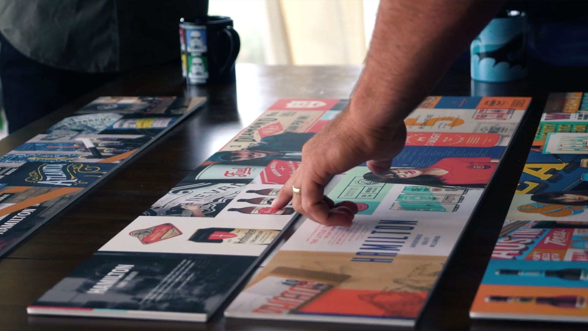
Stylescapes
Chris Do’s approach to creating stylescapes is a great way to keep the big picture in mind while you are working on the individual details.

Serving vs. Selling

 Scott Davis